VicWater Rebrand
The VicWater rebrand was revealed at the 2019 VicWater Annual Conference. I designed the clean modern brand mark, incorporating three water rings to represent each of our members: metro, regional and rural, united together as one.
A logo and stacked or short form version of the mark was created as well as full colour and mono iterations. It was important for the brand mark to reproduce well in both digital and traditional formats, at large and small scale.
The colour palette was selected as a clean take on the historical blue shades commonly associated with water. The fresh aqua palette signifies the forward thinking of the organisation and our Victorian water authority members.

The stacked or short form logo allows for a variety of applications.

A long form version of the new VicWater logo was also created.
Logo Application
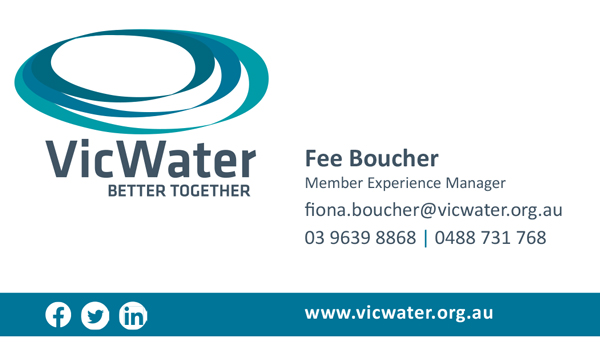
The first application for the new brand mark was the corporate business cards as pictured right. The front of the cards is kept free of clutter, with the staff members name and direct contact details.
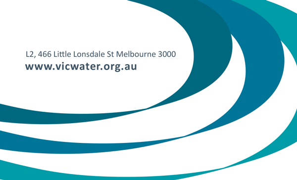
The reverse of the card contains additional details such as the physical and domain address.
The result is smart, professional and contemporary.

Front of Business Card
